Friday 26 October 2012

Group Assignment 2: Paper Planes, Finished!

Another project brought to you by CapFe! This is our final colour wheel assignment. We used the spectrum of visible light (in other words, the colours of the rainbow) and paper planes.


From the other angle.

Now we're just fooling around.
Lisa's gonna eat all the planes!

Me being silly. They're like wings!

Progressively getting darker. The sky, that is.

Here's how it looks like at night.

Our classmates on the presentation day.


These are the other group's works!
     

Thursday 11 October 2012

Group Assignment 2: Colour Wheel


I was in CapFe's group again, consisting of me, Zue, Lisa, Rosey, Li Wei, and Kush! We were given some time to discuss in a group on what we wanted to do. These are some of the things we brainstormed about.


Miss Lisa liked our lamp, and paper planes idea. We decided to carry on with the latter, which was originally suggested by Li Wei.

Tuesday 2 October 2012

Individual Assignment 7: Process and Finished work.


We were given a quick exercise yesterday to test our colour theory and colour psychology skills. Basically we had to match a font to the six colours given, and give a word that best describes it.

Screenshot of me going through Adobe Illustrator, trying to find the right font!

Half of the work is choosing a suitable font. That meant going through free font sites such as dafont.com and my computer's existing font bank to look for a font that matched the mood of the colour.


[Fonts used: League Gothic Regular, Ostrich Sans bold, Ostrich Sans medium]

Black: Corporate. The colour black to me is a formal colour, since it does not have any "colour" or hue, per se; it gives off a serious mood. Corporations are serious business, hence the choice of word. The font I chose is a simple, no-nonsense one.

White: Clinical. Since the colour white is hard to see on a white background, I used a font that had a black outline. The colour white is clean and pure. The first thing I think of when I think of the word white are clinics, and the imagery of long hallways and sterilised medical equipment. The font chosen for this one is also a rather serious font, albeit giving off a slightly different mood from the previous one.

Grey: Calm. Most people may think the colour gray is dull. But I like to think of it as a neutral colour, therefore making it give off the impression of calmness. A tall and thin font was chosen, almost resembling a calm, clear mind.

 [Fonts used: Edo SZ, Shagadelic bold, Snell Roundhand black]

Red: Passion. RED. PASSION. THE BLOOD OF OUR ENEMIES. That was the first thing I thought of when I see the colour red. Look at that brush-like font. Almost looks like blood, doesn't it? THE BLOOD OF OUR ENEMI-- yeah okay I'll stop. Red gives off a very passionate feeling because of its intense hue. Really makes you feel like being really passionate about something like KILLING FOR THE BLO- okay no. But there is no doubt that red is sometimes associated with passion.

Blue: Peace. This shade of blue conveys a rather serene feeling, like the blue sky or a calm blue sea. Serene and peaceful. Ironically, I chose a 60s-esque sort of font for this, because peace is often associated with the 60s. Peace out.

Purple: Elegance. Purple does not only resemble royalty, but elegance as well. A sophisticated font was chosen for a sophisticated colour. In addition to the colour purple, cursive fonts also tend to look very fancy and sophisticated themselves.
[Fonts used: ChunkFive, Calgary Script OT, my own font a.k.a. my own handwriting!]

Brown: Stability. Brown is a very earthy tone, so it makes sense that a word to associate it with is Stability. The font chosen is a chunky, serif font to represent something being very grounded. (Get it? Grounded? Earth? Haha okay nevermind that was a lame attempt at trying to be clever)

Pink: Feminity. This one is rather obvious and stereotypical. Barbie dolls, My Little Ponies, and most other toys targeted to girls are pink. Other brands for ladies are usually pink too. The cursive and playful font I chose kind of reminds me of Katy Perry.

Aina: Light blue! I chose light blue to represent my name because it's my favourite colour. And I thought, what better way to represent myself as a font by using my own font! In other words, my own handwriting. I wrote my name with my graphics tablet in Photoshop for this.

That's all for now!

Monday 1 October 2012

Individual Assignment 7: Colours and Emotions

Today in class we learned a little about colour theory, and colour psychology. That is, how colours can invoke and convey emotions. While a lot of the interpretations are subjective, these theories in general are an extremely useful element of design that can be applied to many things from branding to interior decorating and even fashion!

There are so many articles and charts on the net about this topic. Here are a few I found.


[source]


Thursday 13 September 2012

Individual Assignment 3: Grids


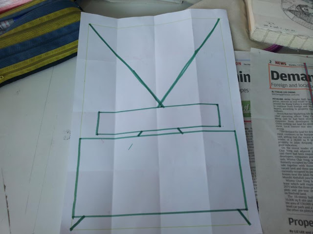
 Miss Lisa taught us that a good way to get a simple grid is by folding the paper in half a few times and then unfolding it. Using that technique, these are what I came up with:


This was my first sketch for the magazine article. Miss Lisa said my pull quote was too big, so I did another one.


 I learned that the "X" in a box represents an image.

And here's the one I did for the poster. A poster consists mainly of the image, that's why the big "X" covers almost the whole paper.


Wednesday 12 September 2012

Extra: Other group's works!

Besides CapFe's umbrella stand, here are the other groups and their finished furniture designs that were presented that day!


Group Assignment 1: Finished Furniture!

CapFe Industries present; the steampunk-inspired umbrella stand!


Our presentation went fairly well. I'm so glad we managed to pull through to finish this. :']

Sunday 9 September 2012

Extra: Mindblowing Logos

I was browsing some design sites the other day, and I could. not. get over these crazy cool logo designs. It's so clever. Really inspiring, too. I wish I could come up with something as brilliant. These two were my personal favourite:


More from [here]

Design research, or procrastination? Depends on how you look at it, haha. Bye for now!

Thursday 6 September 2012

Individual Assignment 2: Composition & Design

In this week's lecture, we learned about composition and framing, as well as the design process. For our assignment, we had to go around campus and take 20 photos of a certain subject, using our cutout frames made from mounting board. The frame made it easier to see the composition, since it blocked out a portion of the view that was not in the composition.

At the end of the day, we had to take an extra 30 more photos of the same subject. My subject matter was initially signs that I found around campus.

Wednesday 29 August 2012

Group Assignment 1: Furniture Design Progress


After consulting with Miss Lisa in our first group tutorial and telling her about our change of plans, she said it was okay and we were advised to use silicone glue to put our umbrella stand together. Last saturday, we went to Ace Hardware at Ikano Power Centre to buy some supplies (such as silicone glue, spray paint and bits of plastic pipes for our steampunk-styled decorations) before heading over to my house to build it.

My house has been renovated recently, so there were a lot of spare parts lying around that we could use for our project.


Figuring out how to put it all together. That's what I call improvising, heh.


We found old table legs and CD racks to use for the umbrella stand!


Cleaning the parts before painting, to make sure we don't paint over dirt.


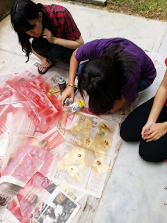
We dismantled the CD rack and started spray painting it red, and the table legs gold. Our inspiration was Iron Man, with a steampunk twist.


We have to wait one day for the paint to fully dry. I'm glad we bought the spray paint. It really gives a finished look to everything.

After this, all that was left was to glue it together using silicone glue, and decorate it! Silicone glue is really strong. It's the glue used to piece together the glass of an aquarium!


Our progress so far.