Sunday 10 March 2013

Assignment 3: Composition Video, Rule of Thirds

For this assignment, we had to take about 30 photos based on a central theme, using the principle of compositions and the rule of thirds, and then compile those photos into a video.

The first part of this assignment was done in-class, and for the other part we were given about a week to take more shots to complete our video.

Embedded below is a video of the photos I took:


The theme I chose initially was chairs. I went around campus and took photos of them, trying to vary each shot compositionally. I was told that my photos were a bit boring (oops), so I decided to change my theme to cutlery instead. I layed them out on a table and arranged them in different patterns. Most of these were taken  from one angle only, so that the cutlery appears somewhat 2-dimensional, giving more focus to the arrangement

Now, on to explaining the Rule of Thirds. What is it? Well, it's one of the most basic principles in design and photography, involving how to achieve good compositions using a specific grid.


This grid divides your canvas into thirds. The intersecting points of the grid are generally good places to place your focus point, that is the part of your image that you want to emphasise.


Here's a gif from wikipedia to illustrate:


And here are a few examples of photos that utilise the Rule of Thirds:


One mistake that most beginners (and I myself have admittedly done), is to divide the canvas into two equal parts. While this can sometimes be pulled off, it generally is better to create a focal point that is not directly in the centre of the canvas. Hence, the Rule of Thirds is a simple way to add variety to a composition! :]

Saturday 9 March 2013

Assignment 2: Self Portrait Based on an Art Movement


For our next assignment, we were asked to make another self portrait, but this time based on an art movement of our choice, and write up about it a little.

For this assignment, I chose Pop Art as the art movement that I liked. This piece was created using an actual picture of myself, and some photoediting in Photoshop.


First of all, Pop Art is an art movement that started in the early 1960s. Pop Art focuses on celebrating commonplace objects and people in everyday life.

                                     
Roy Lichtenstein's work


Campbell's Soup Cans, by Andy Warhol


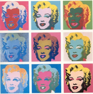
Marilyn Monroe, by Andy Warhol

I wanted to incorporate this painting of flowers by Andy Warhol into my piece.

Researching on colour schemes, taking note of the use of bright and vibrant colours

 Deciding colour schemes with the help of colourschemedesigner.com


I chose Pop Art as the art movement that I liked mainly because of the visual aspect of it. I've always liked Andy Warhol's art, his "Marilyn Monroe" piece in particular, and I wanted to see what it would be like if I were to recreate a piece of work using that as inspiration.

The most difficult part of this assignment for me was deciding which colours to use. I experimented with many different colour schemes before choosing this one. If you noticed, the top left square has the same colours as the bottom right square, only that the placement of colours are different. Same goes for the top right and bottom left square too.

I think Pop Art expresses a bit about the type of design I like too, which is "simple but effective". The 1960s in general is a great source of inspiration for me. Also, bright colours are something I'm not used to, but wish to incorporate in my work. Colours and colour schemes have always been a struggle for me, so this assignment made me learn a bit more about different colour schemes, such as complimentaries, triads, tetrads, and analogous. This self portrait represents the many facets of me and my strive to go out of my comfort zone to learn more.